Brand Rejuvenation Design of The Roman Catholic Archdiocese of Jakarta
December 2019 | Final Project for Bachelor Degree
The Jakarta Archdiocese is a formal area of the oldest Roman Catholic Church in Indonesia which unites the deacon areas of Jakarta, Tangerang, and Bekasi. The church continues to be challenged to find creative ways to be able to present themselves amid globalization and remain relevant to its people. But at this time, the message to be conveyed by the Jakarta Archdiocese through visual identity is not strong enough so that perceptions understood by people are different. Yet the meaning in visual identity can be implemented in everyday life as the identity of the faithful and a reminder to want to serve others.




Logo Construction
The new visual identity reflects its mission to be a good shepherd and generous. While its new tone of voice is to be more consistent and kind. I developed a custom typeface called Kalos Grotesque inspired by Cyrillic alphabet that expresses the history of an early Christian art through a unique set width character. Meanwhile, the color palette was inspired by the stained glass that is almost the iconic things in Catholic churches.
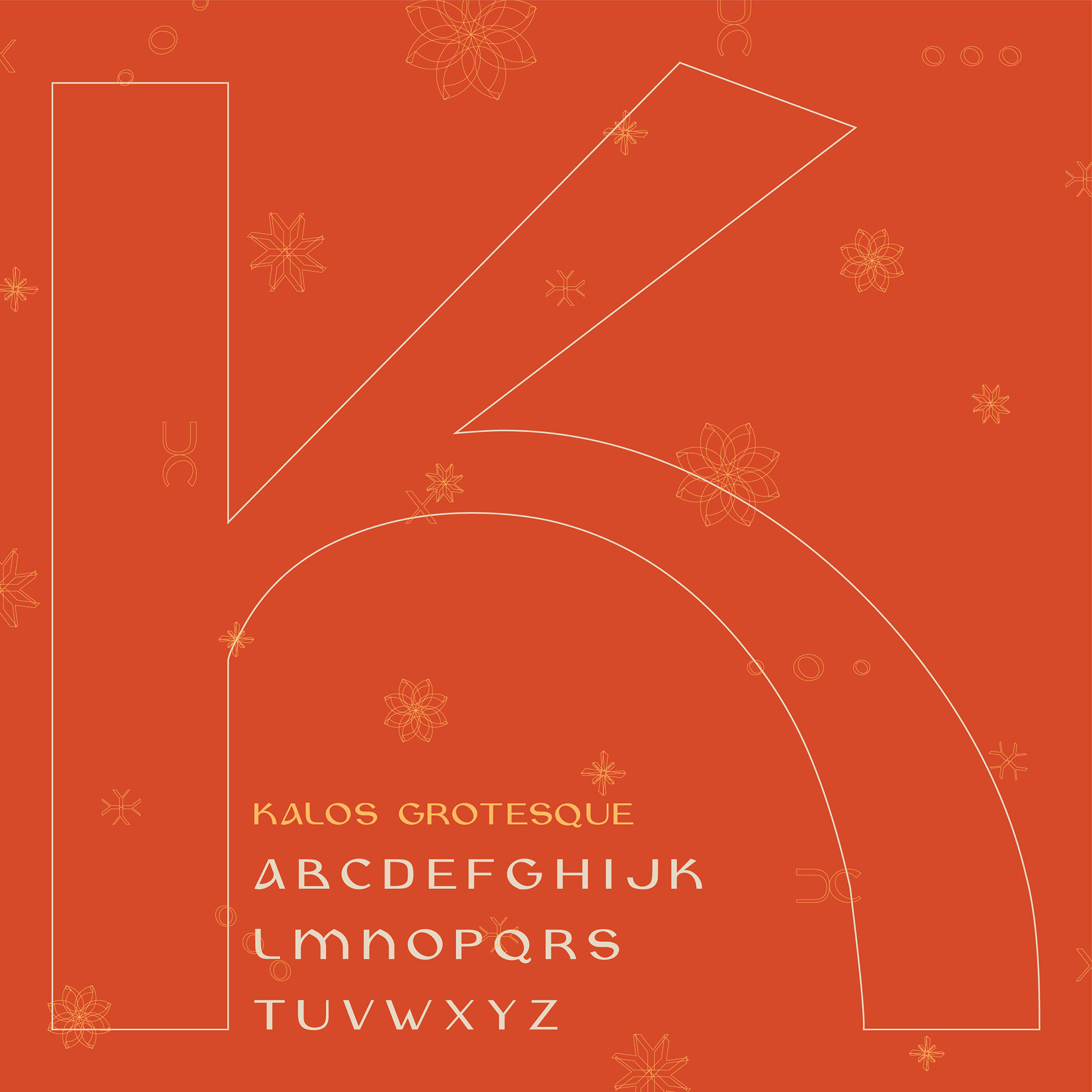

Type Design Kalos Grotesque
Print Collateral Prayer Card, Envelope, Letterhead, Map, Business Card
As a union for Catholic churches, identity is needed as part of the whole community in the church. Therefore, brand rejuvenation can be a solution for the church to remain relevant to the people and strengthen the identity of Catholics. The results of the research that have been obtained, are implemented into visual identity in the form of logos, standard graphic manuals, posters, typefaces, stationery, social media content, and websites.
Print Collateral Business Card
Print Collateral Stamp
Identity Guidelines
Identity Guidelines All Spread
Poster


Merchandise Info Gembala Baik

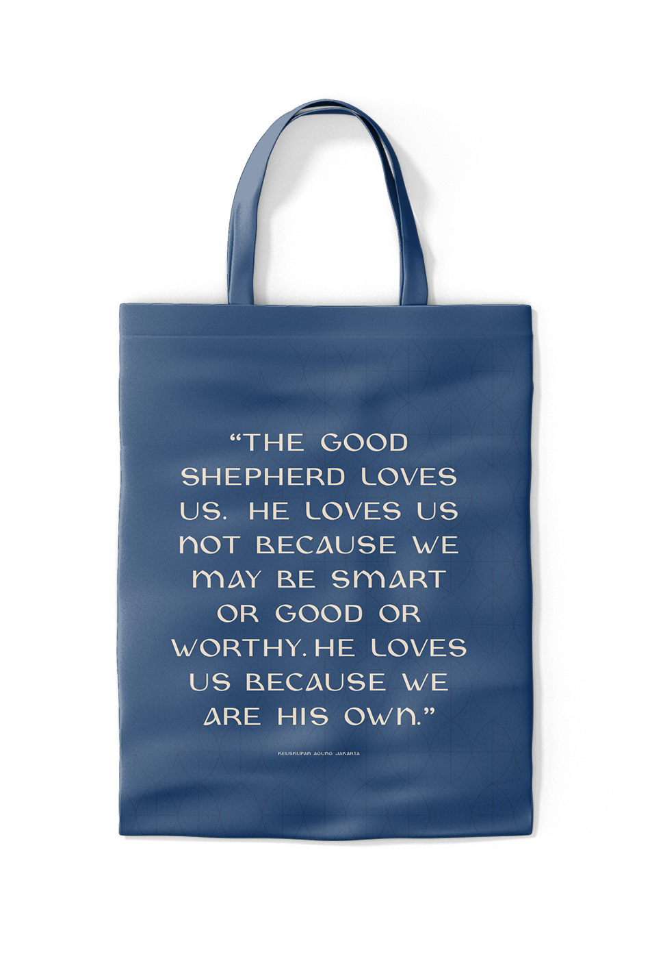
Merchandise Totebag

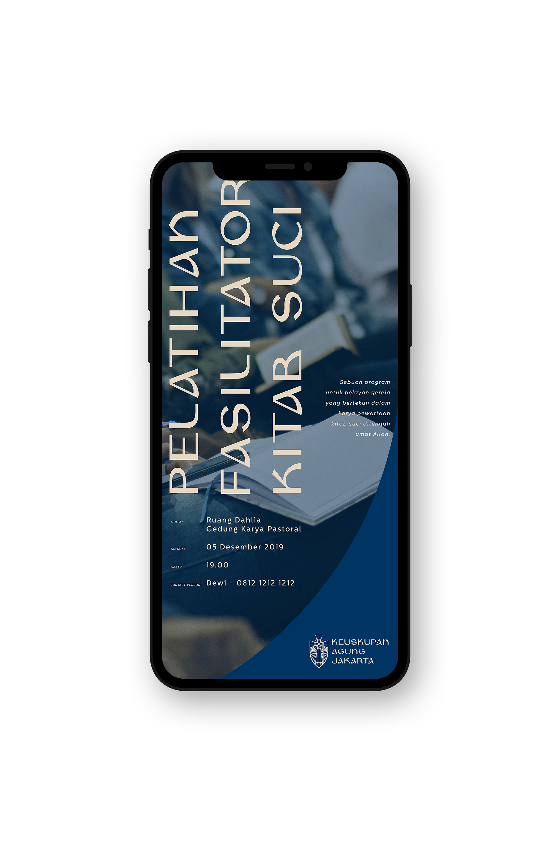

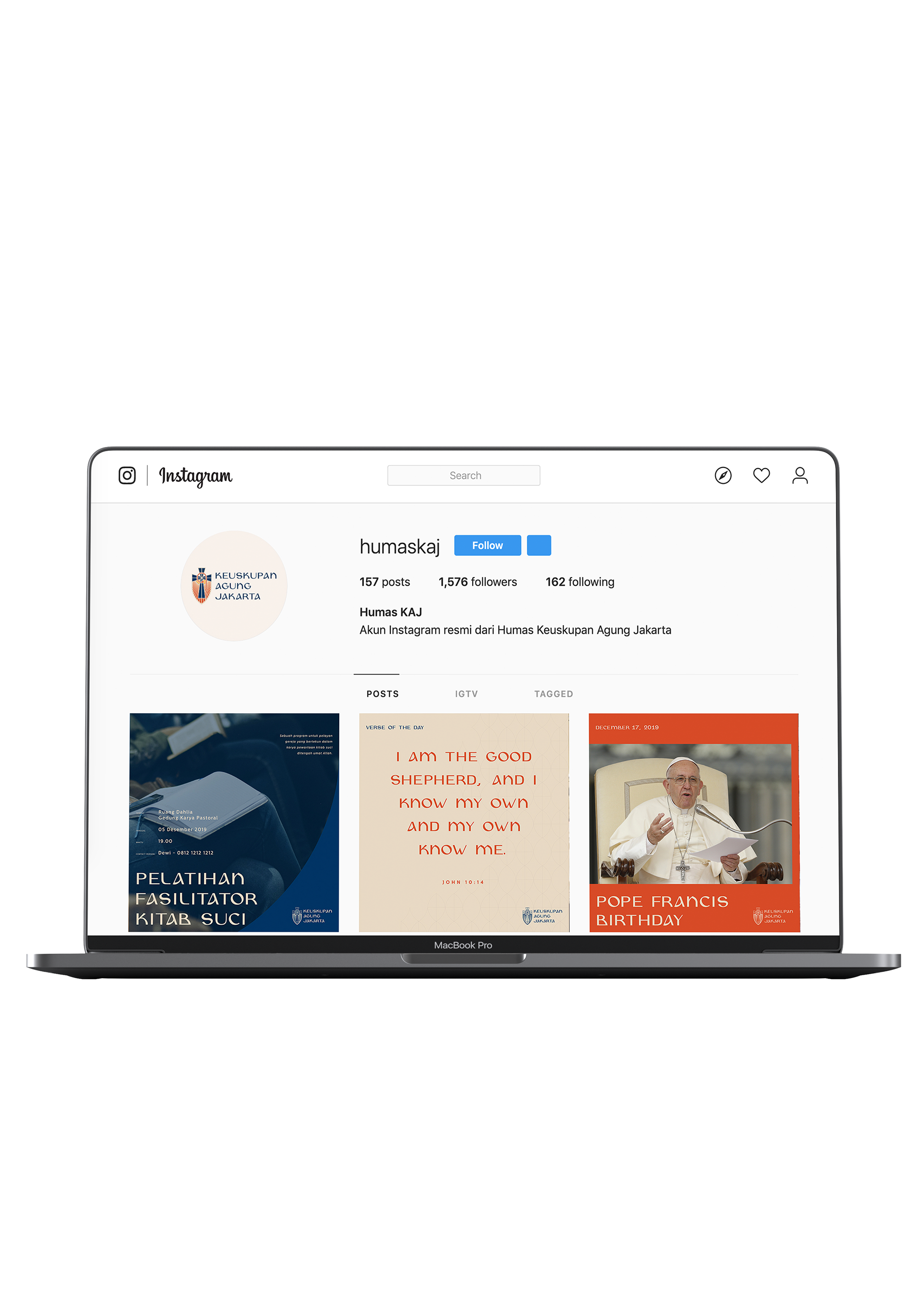
Digital Application Website, Instagram Post, Instagram Story
Theresia Maria
theresiamariasn[at]gmail.com
Jakarta, Indonesia
Portfolio issuu
IG @theresiamsn
