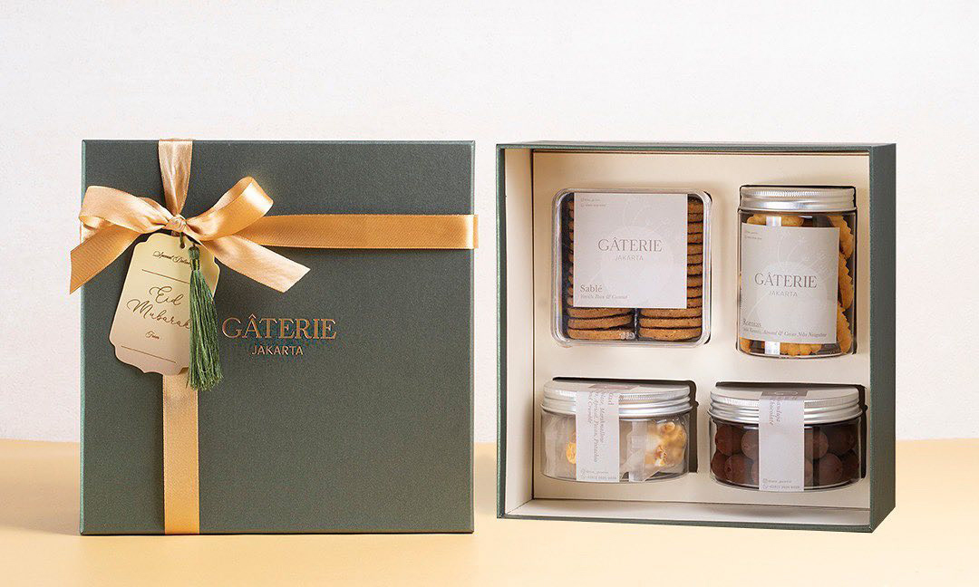
Gâterie
brand identity, logo packaging, social media design
2020
Gâterie in French translates as treat, goody; they strive to be one of the top-notch players in the Indonesia pastry scene through their excellent presentation, flavors combination, and modern interpretation. They aim to be part of people’s special treat in their daily life.
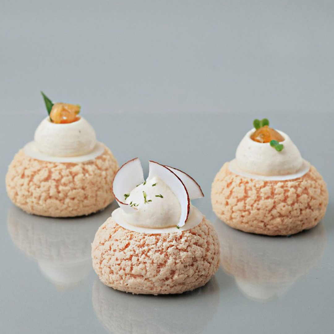
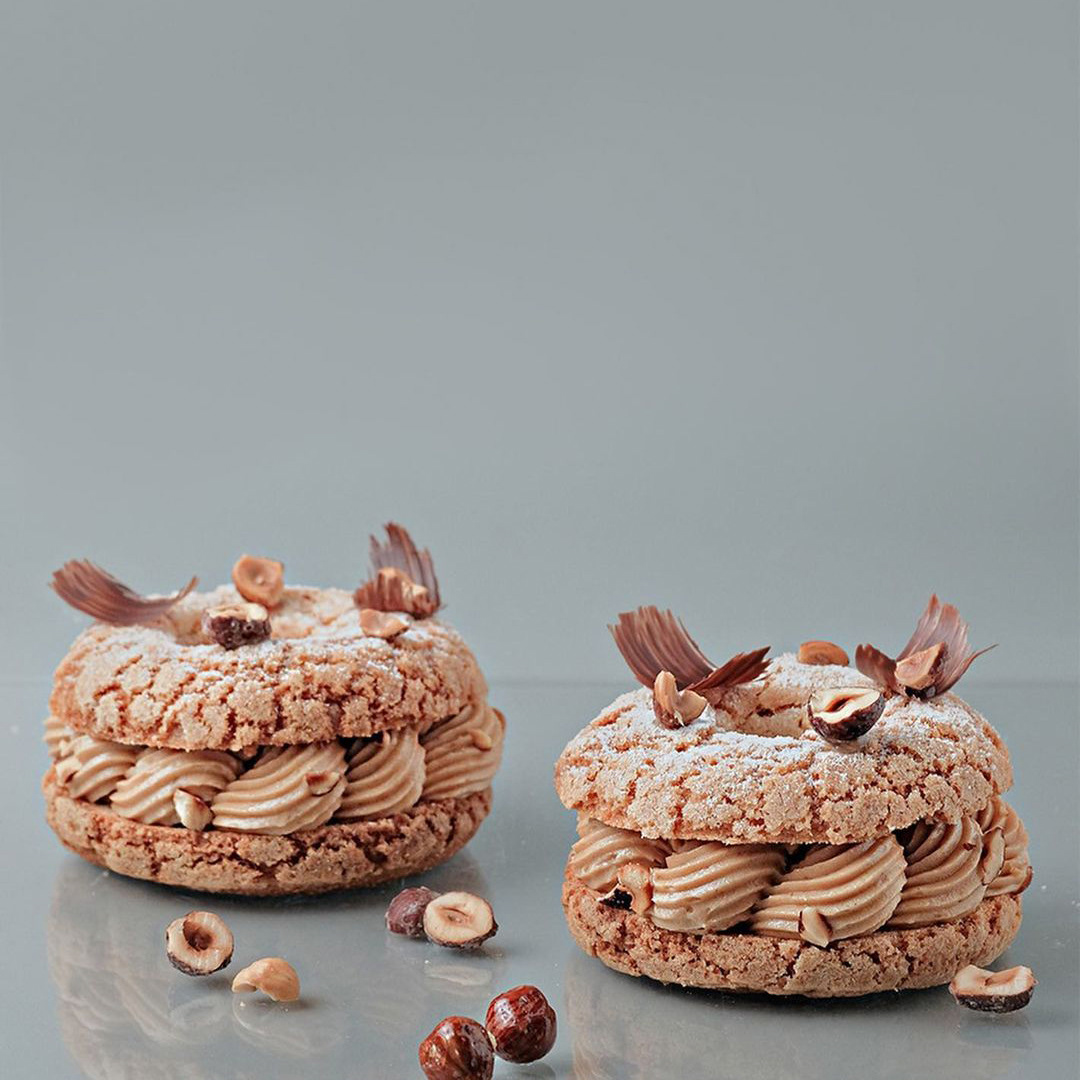
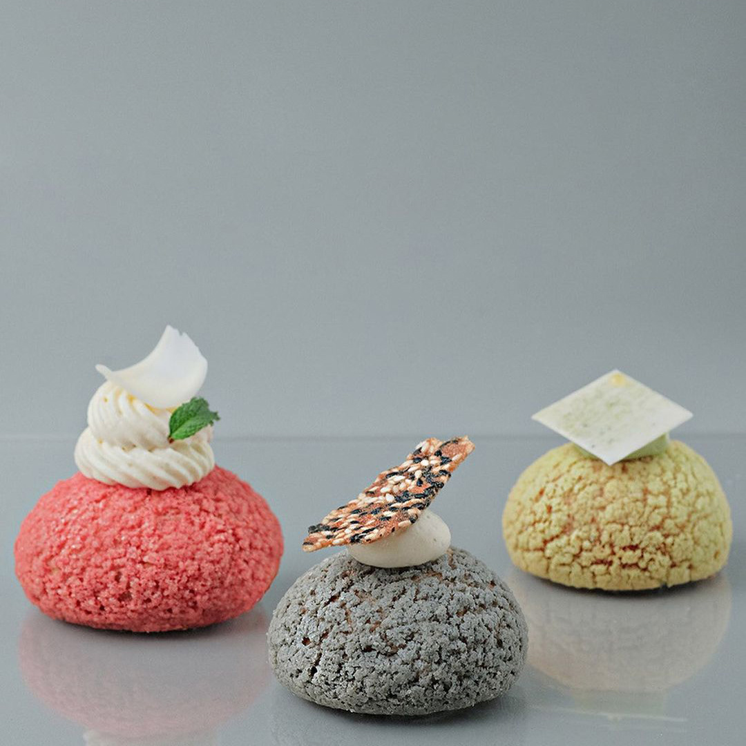
Taste before appearance ‘You cannot eat beautiful picture.’ They strive to present and educate that good quality pastry, although an indulgence, can be healthier too.
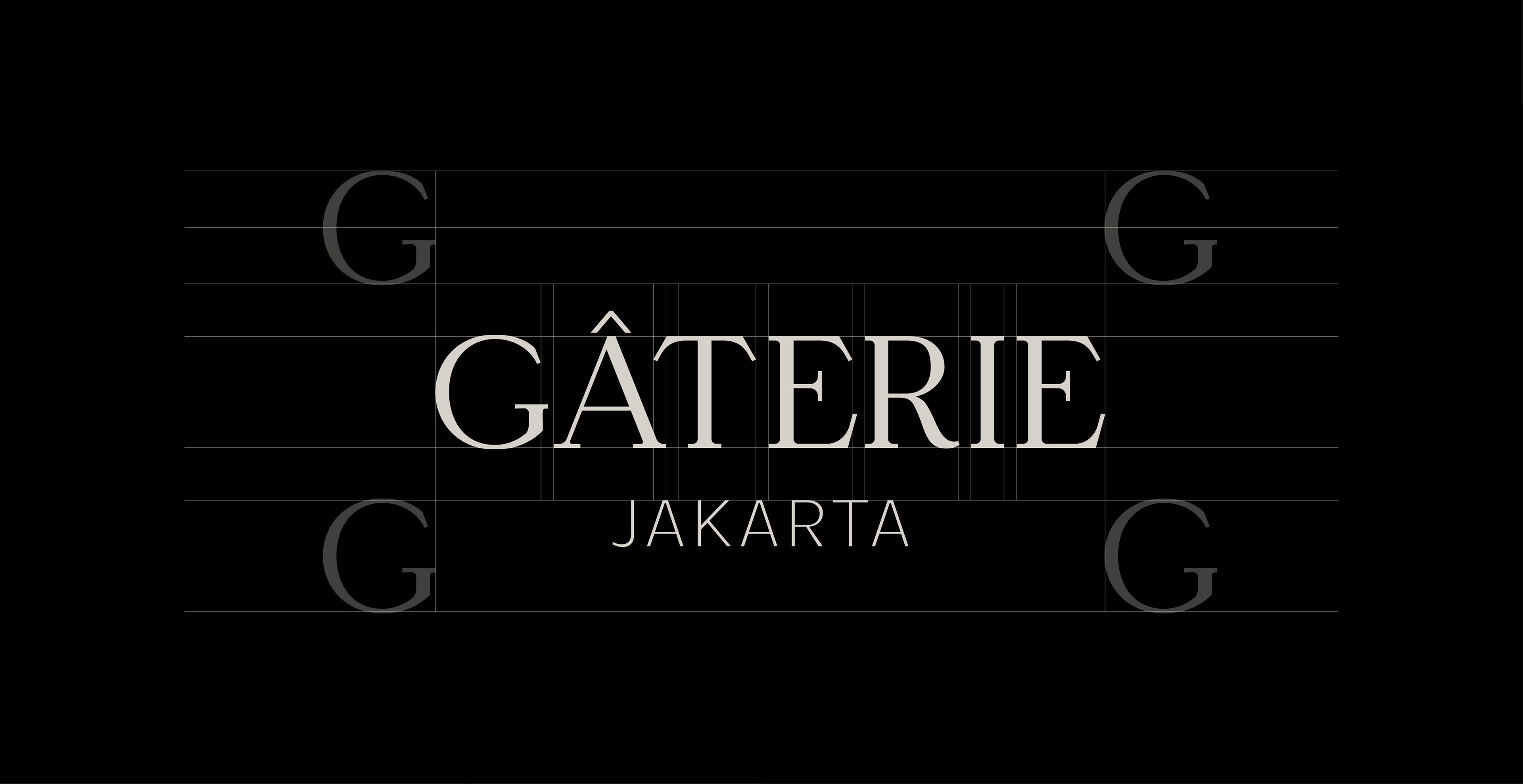
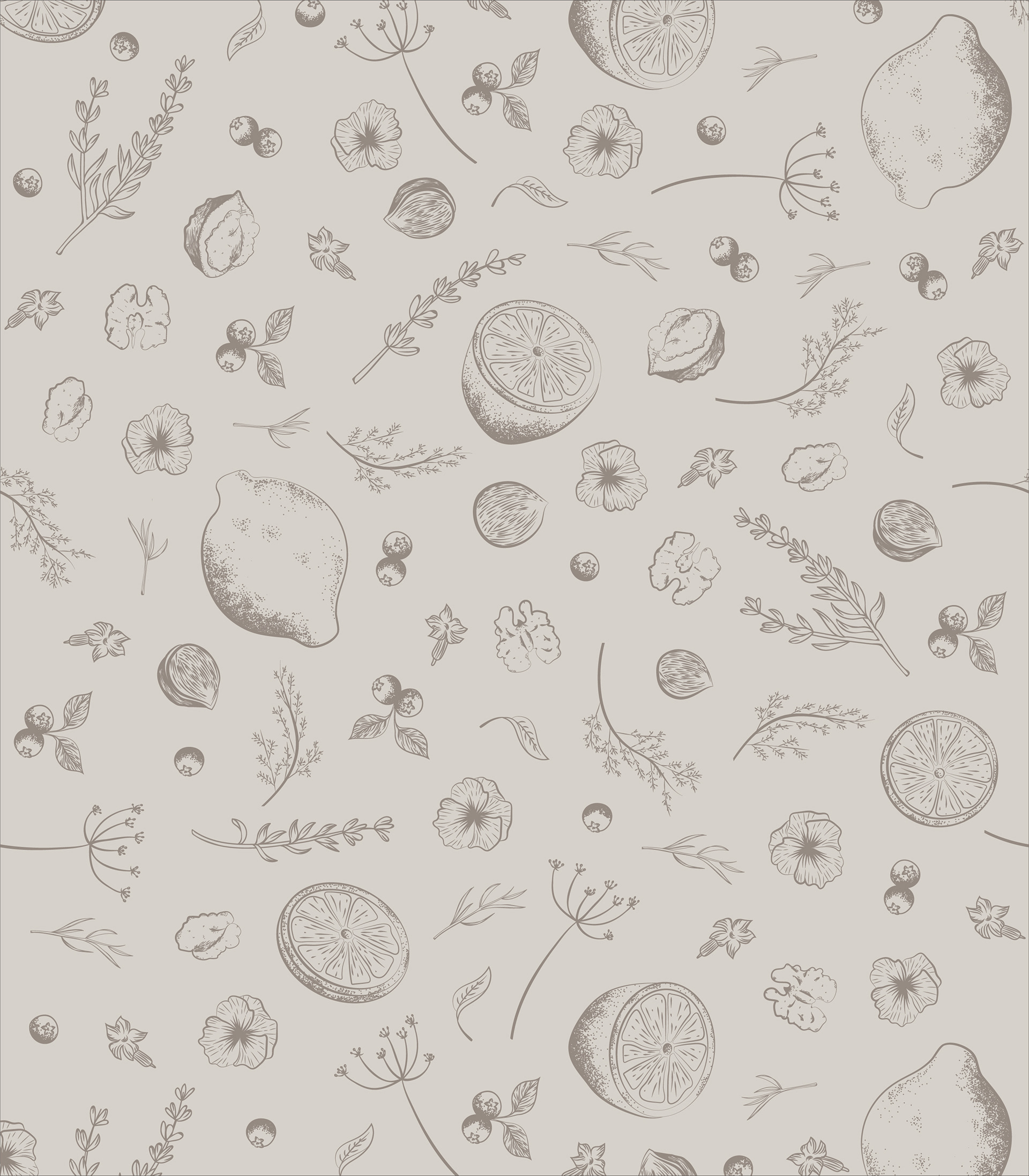
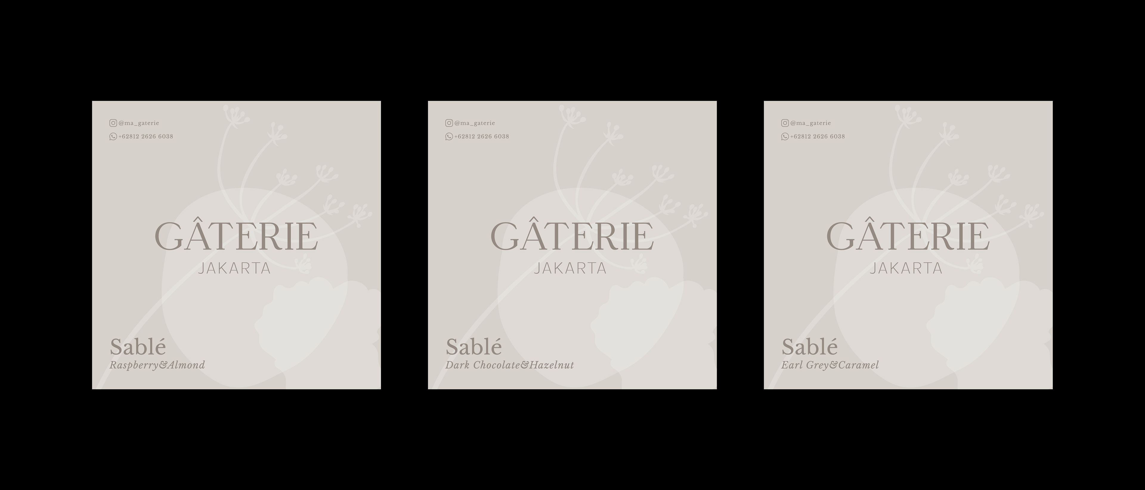
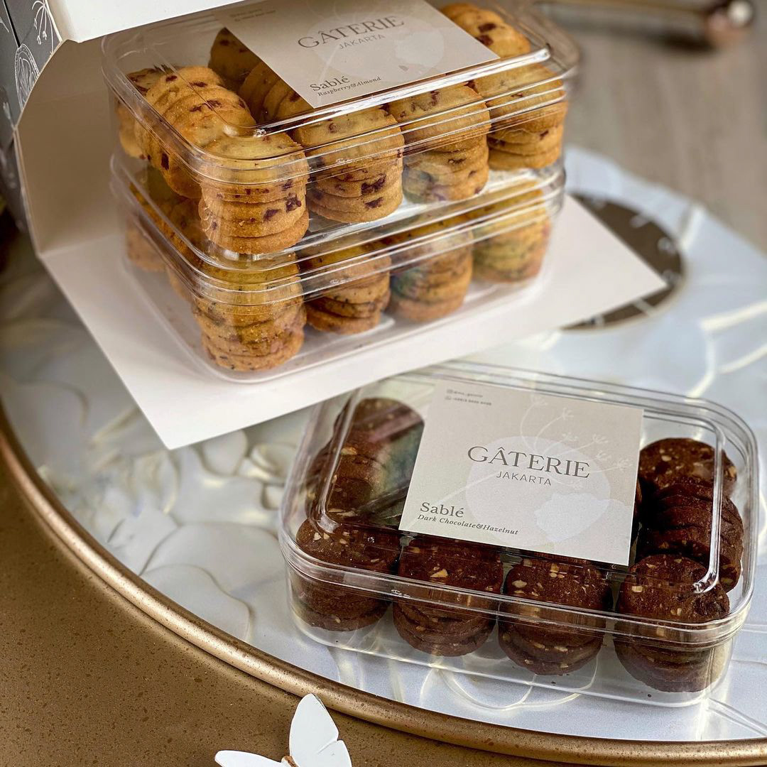
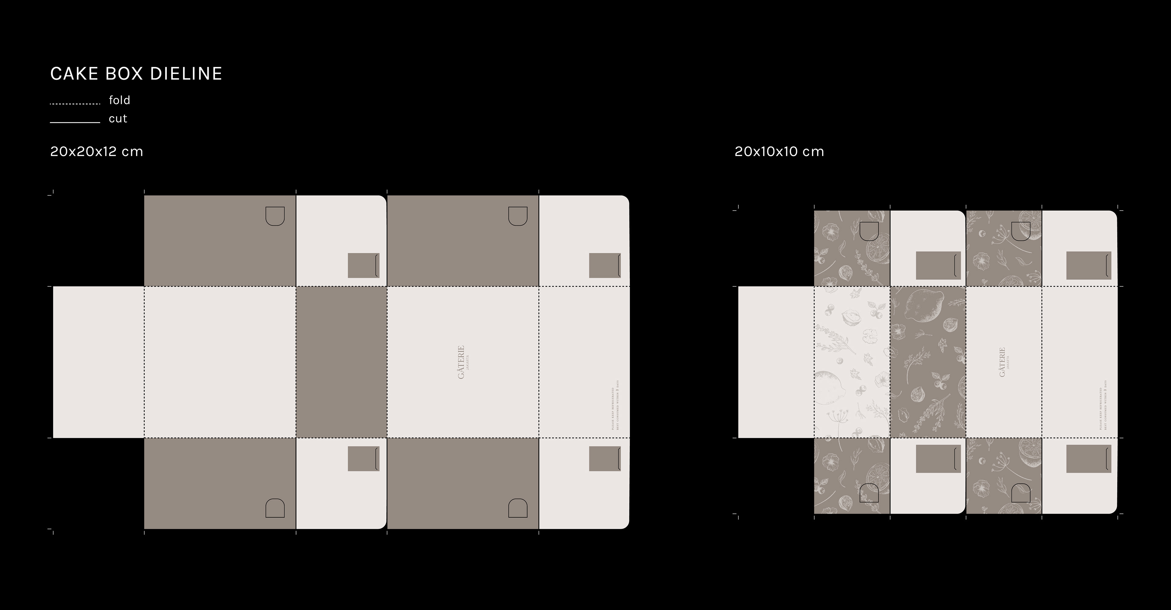
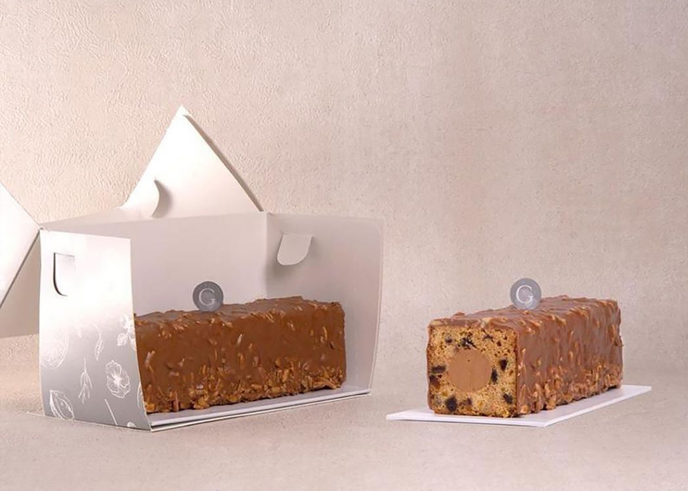
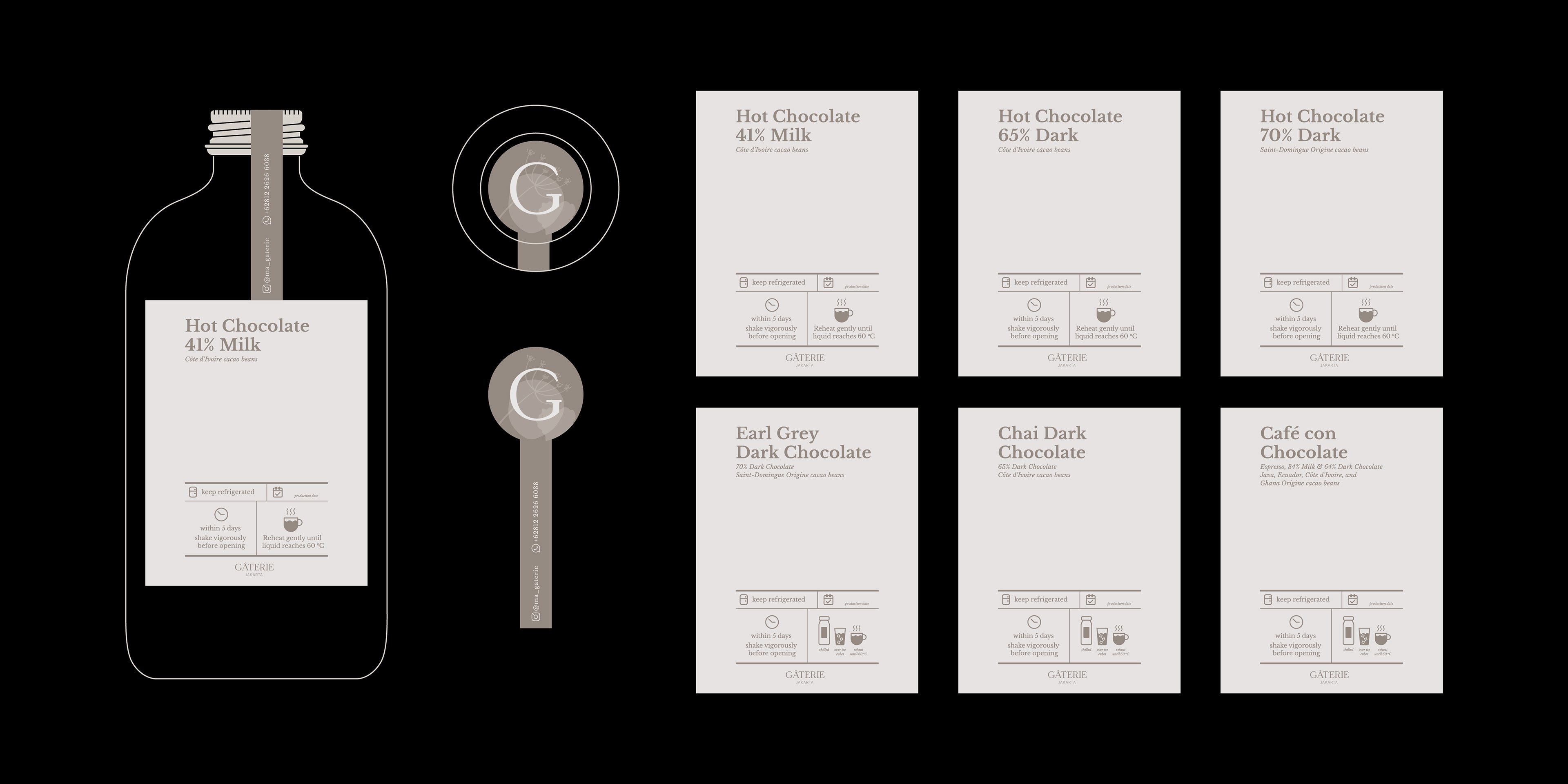
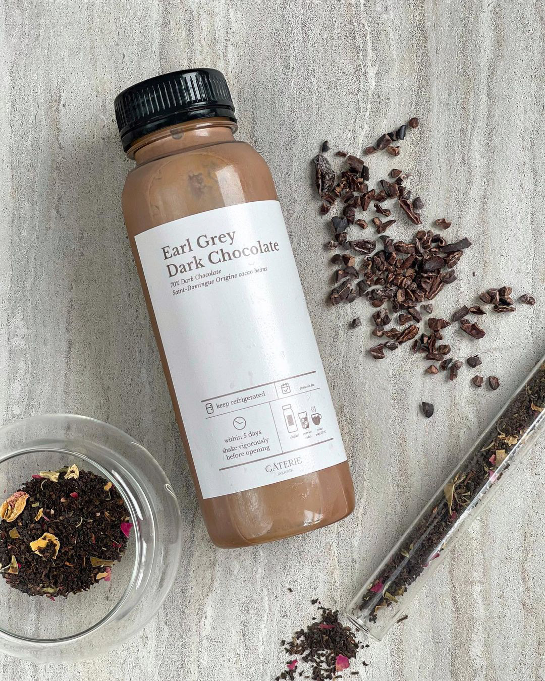
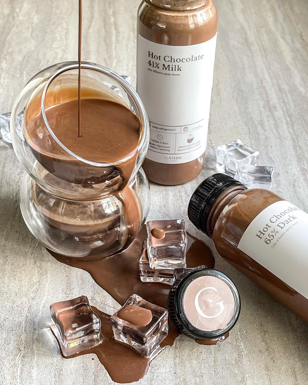
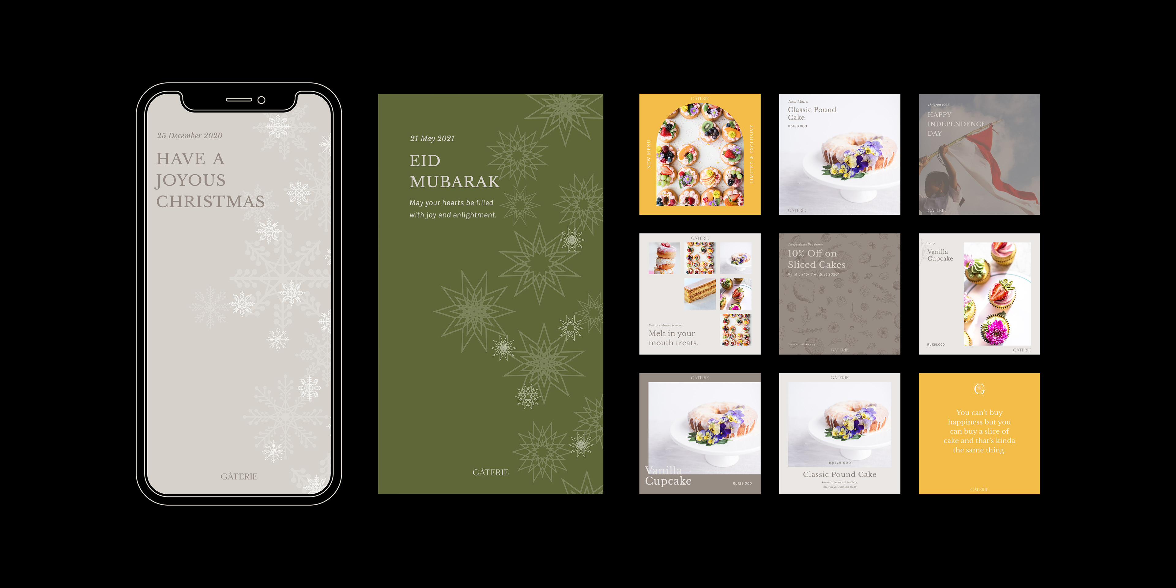
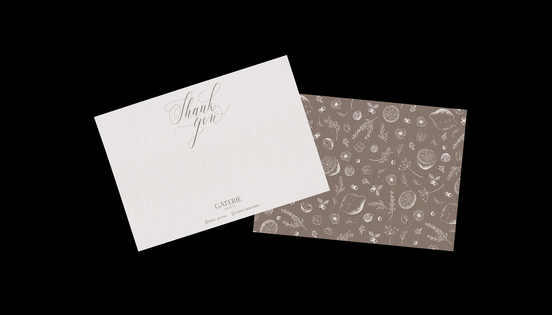
The initial concept was to develop a visual identity to compliment their various pastry selection with a modern interpretation. They want a subtle premium brand image expresses itself throughout the whole identity and packaging design.
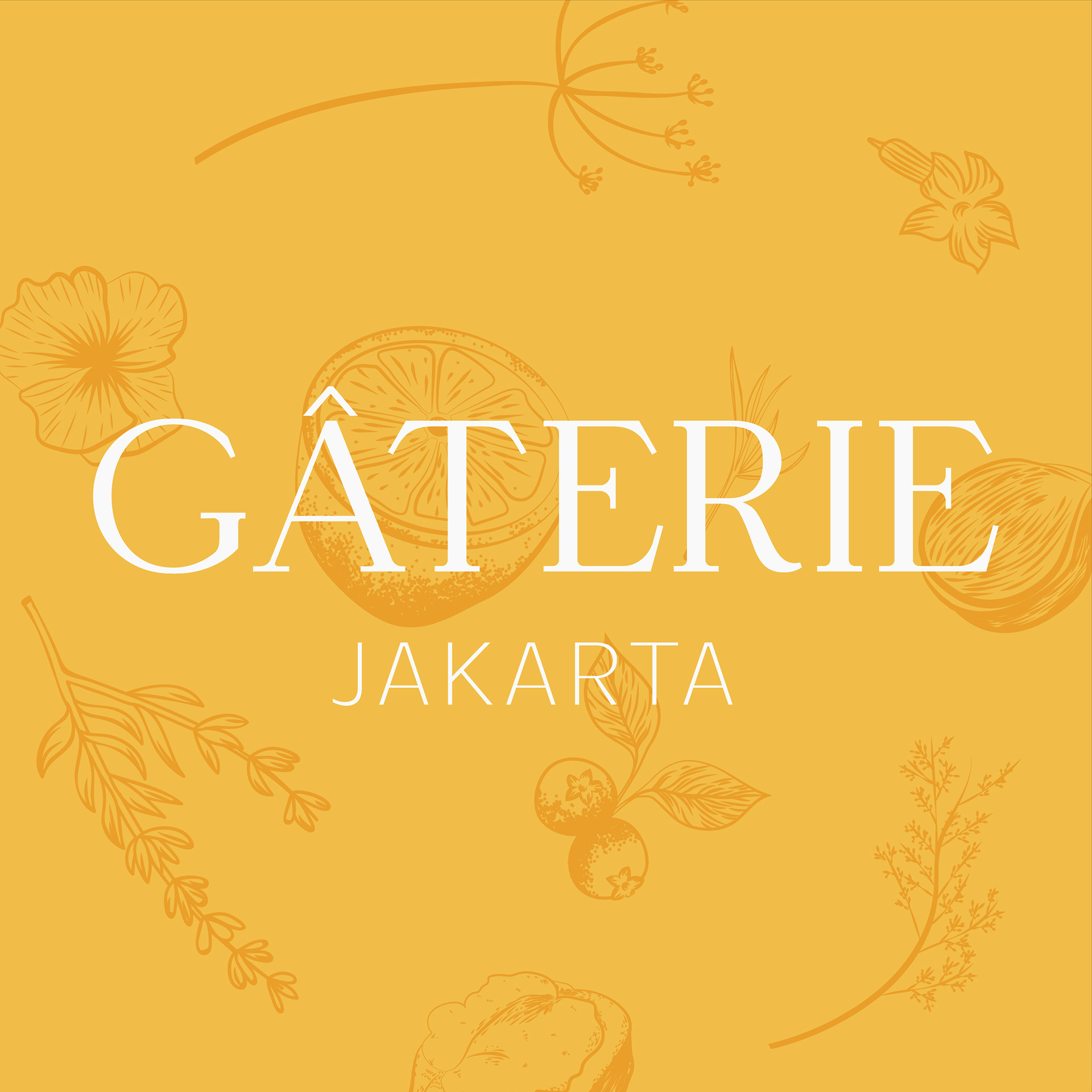

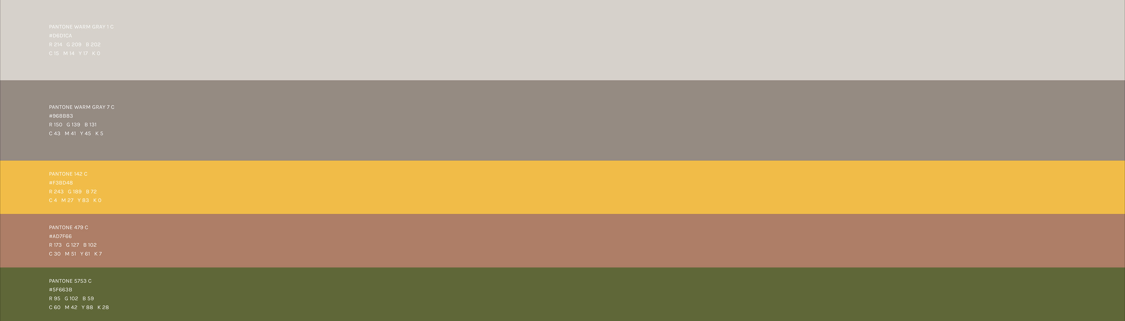
The primary color palette contains of warm gray, dark warm gray, yellow gold, copper, and green. To maintain a consistent brand image, tints of these color can be used but only as an accent.
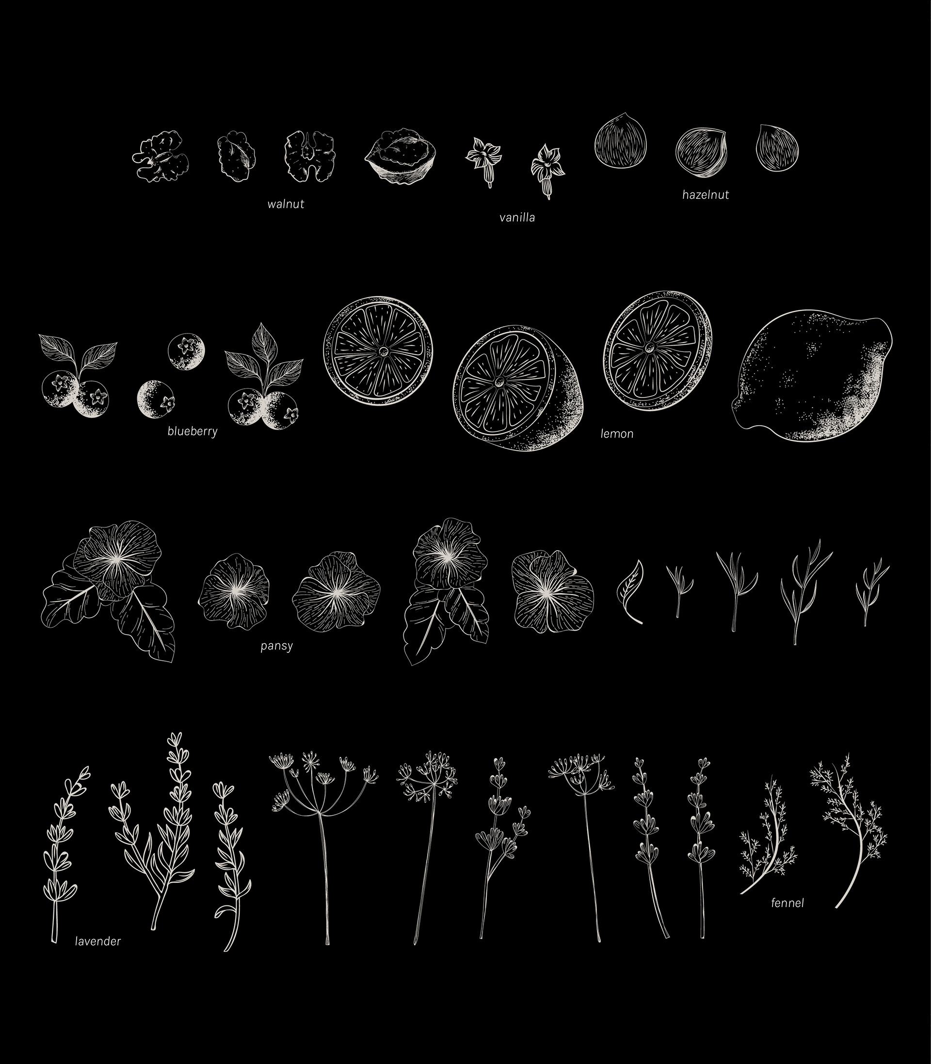
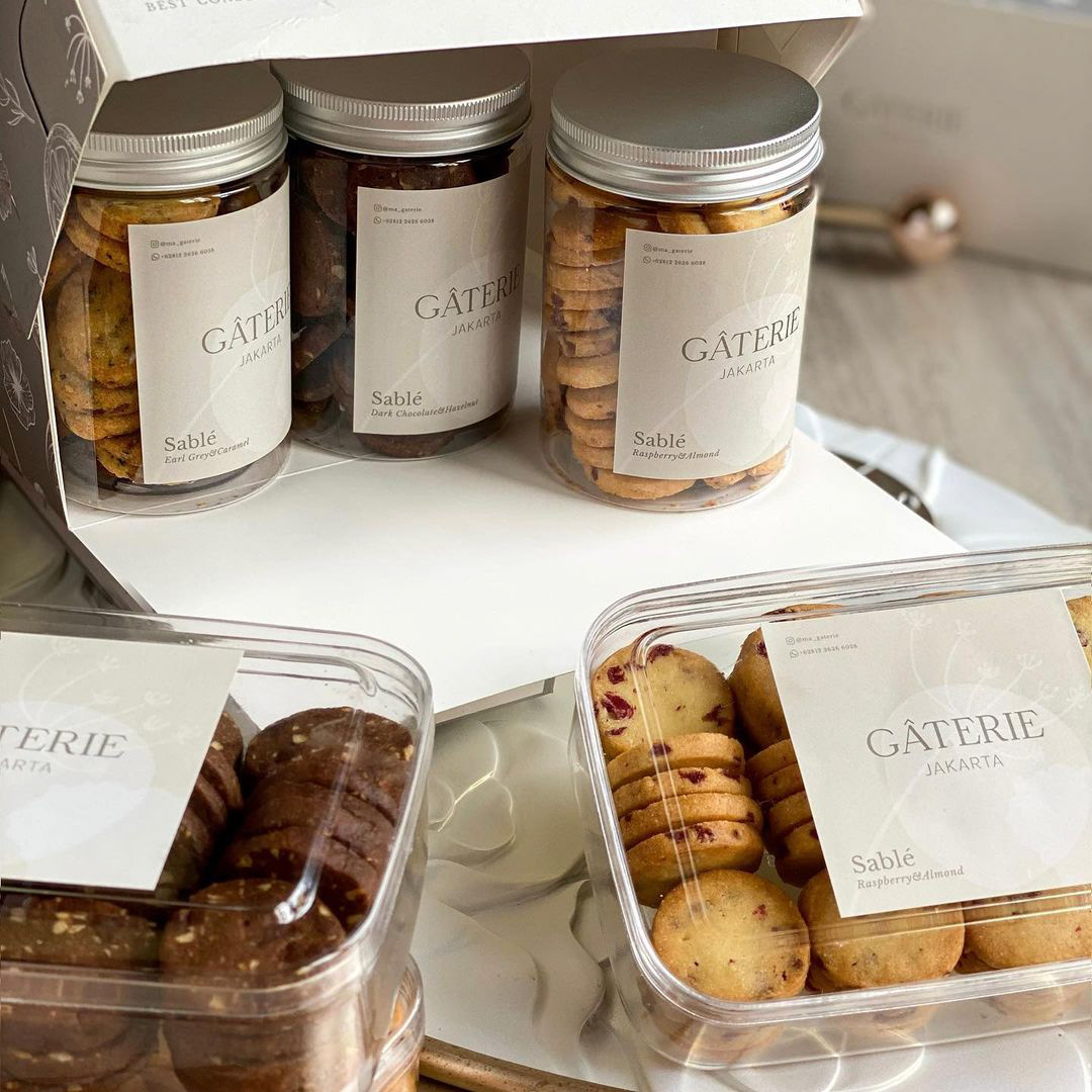
For the illustration, I was inspired to draw the main ingredients that Gâterie use for their pastries such as assortment of fruits and nuts.
CREDIT
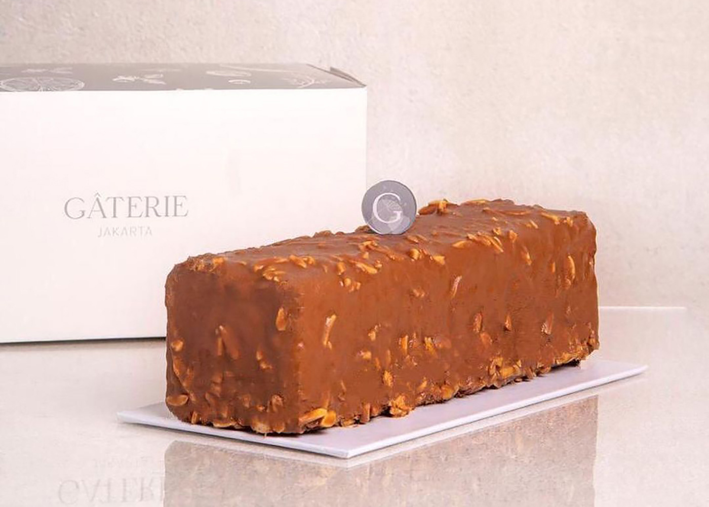
photos @ma_gaterie
DESIGNED BY
Theresia Maria
Jakarta, Indonesia
FOR DESIGN INQUIRY
theresiamariasn[at]gmail.com